Test page
Simple Glass Effect
Advanced Glass Effect
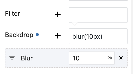
There are two ways to make glass effect. First is simple, it’s when you use backdrop-filter with blur + background with partial opacity. You can add it in Effect panel
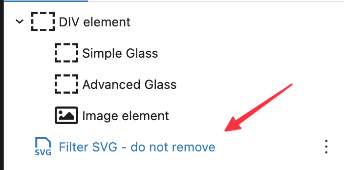
Second is more advanced with distortion. For this, you will need to have special SVG Image, so copy next block on page, you can put it in footer or in any place, it’s just must be somewhere on page
Now, you will need next code to be added in Custom css of block
{CURRENT}::before {
  content: "";
  position: absolute;
  inset: 0;
  border-radius: 10px;
  padding: 1px;
  background: linear-gradient(
    to bottom,
    rgba(255, 255, 255, 0.25),
    rgba(255, 255, 255, 0.02)
  );
  -webkit-mask:
  linear-gradient(#fff 0 0) content-box,
  linear-gradient(#fff 0 0);
  -webkit-mask-composite: xor;
  mask-composite: exclude;
  pointer-events: none;
}
{CURRENT}{
  border-radius:10px;
}
{CURRENT}:after{
 content: '';
  position: absolute;
  inset: 0;
  z-index: -1;
  border-radius: 10px;
  backdrop-filter: blur(8px);
  filter: url(#glass-distortion);
  isolation: isolate;
}
This code includes not only blur effect but also partial transparent border. If you need only blur, then use
{CURRENT}:after{
 content: '';
  position: absolute;
  inset: 0;
  z-index: -1;
  border-radius: 10px;
  backdrop-filter: blur(8px);
  filter: url(#glass-distortion);
  isolation: isolate;
}
If you add border radius, make sure that you added it the same across whole code
Add modern blocks to sites on WordPress
Esse officia proident sint ut occaecat velit esse dolor qui est exercitation tempor incididunt sunt officia irure exercitation cupidatat